Building an Editor: Decreasing the time to publish (by 44%)
Writing and publishing a blog post or press release is at the core of the Prezly product and we want to make it better, faster, more powerful and easier to use.
But building an editor is bloody hard and in a post last year I listed a number of things I find important when it comes to the writing experience.
Since then we've been spending a lot of time on improving the Prezly editor. One of the ways to measure our progress is to look at the time it takes for our customers to complete the journey from creating the draft to the final publication of that story.
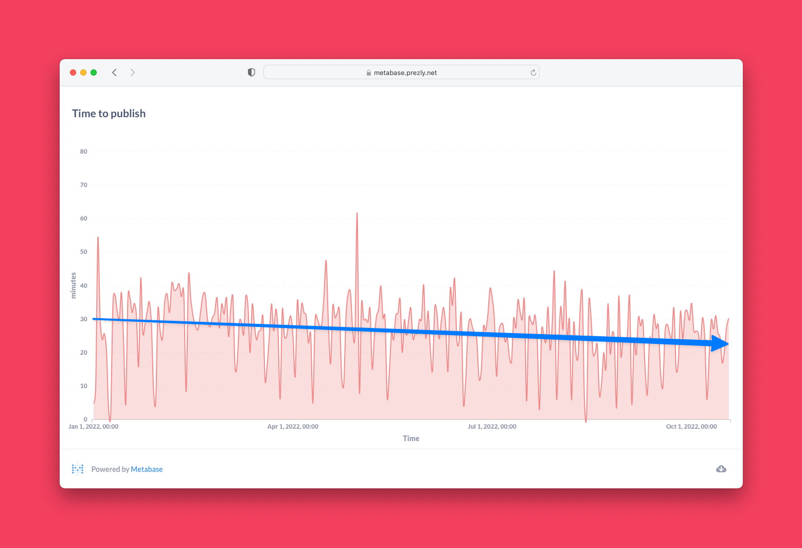
In about 1 year we have decreased the time from an average of 33.8 minutes to 22.6 today. In this post, I am going to highlight the many changes we made.
Adding blocks to a story
One of the main ways to insert anything else than text is to use what we call 'the plus menu' which is a lot of CMS/content editing platforms perhaps like Notion.
We noticed through qualitative and quantitative feedback that some of our customers didn't know that there is a [+] menu in the first place. That's why we improved the empty state and added a tooltip and improved copy to encourage customers to try it.
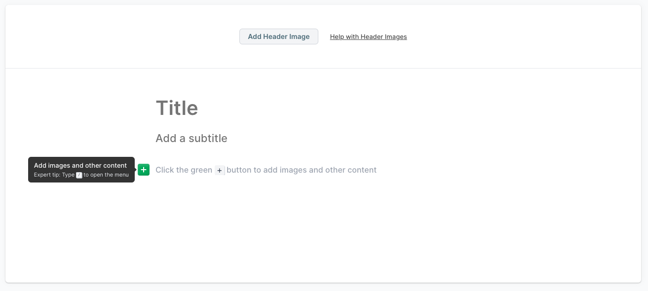
The [+] plus menu
The menu is a powerful tool to mix text with any of the other blocks that are available in Prezly like galleries, videos, file attachments or regular embeds.
![Different variations of the [+] plus menu Different variations of the [+] plus menu](https://cdn.uc.assets.prezly.com/e40212b1-49e7-412e-b1a0-d08930b0f5b5/-/format/auto/Screenshot%20at%20October%20%2018%20-%20000018.png)
We looked at 100s of sessions of how people were using the + menu and made a lot of small/improvements:
- Improved positioning of the menu on different viewports or when scrolling
- Better (fuzzy) search
- Support alternative keywords (aliases) for blocks. Searching 'youtube' will find the video block
- Added a suggestions menu with the most used/important blocks
- Smarter positioning of the flyout menu (when scrolling). See below.
In-between content
Once you have a story with some content you might want to add some multimedia in the middle. One of the challenges is that the + menu icon only shows up on an empty paragraph. And to add an empty paragraph you need to move your cursor to the beginning or end of a paragraph and hit enter.
This works if it's a paragraph but becomes annoying if you want to add a block between two other blocks and even impossible if the first element in the story is a multi-media block 😱.
Initially, we wanted to solve this with icons that allow you to create an empty paragraph before/after similar to how CKEditor is solving it.
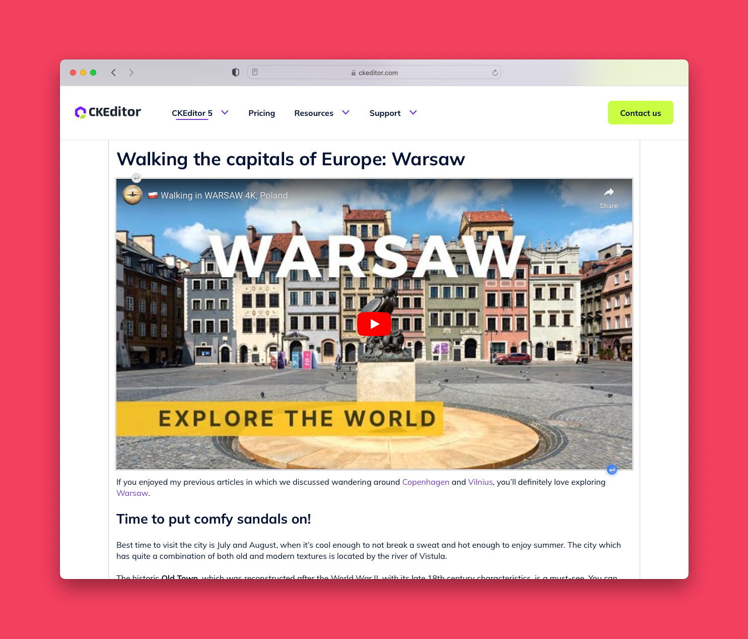
But the prototype we built came with some challenges and looked messy with the existing options/block menu we already have.
We landed on some virtual whitespace before/after a block that can be used to insert a new paragraph.
Keyboard Shortcuts
In addition to a workflow that involves touching your mouse we also added support for keyboard shortcuts:
- Ctrl + Enter (Cmd + Enter on 🍏) to insert below the current block
- Ctrl + Shift + Enter (Cmd + Shift on 🍏) to insert above the current block
The goal is to add additional keyboard shortcuts for common-used actions like inserting a video, linking the selected text, etc...
Component Controls + Placeholders
We cleaned up the UI of the component controls and made them dark. There was a lot of discussion around the dark UI but the main idea that ended up making it was that this way it contrasts with the rest of the editing experience highlighting that the dark menus are extra things/settings you can do with every editor block.
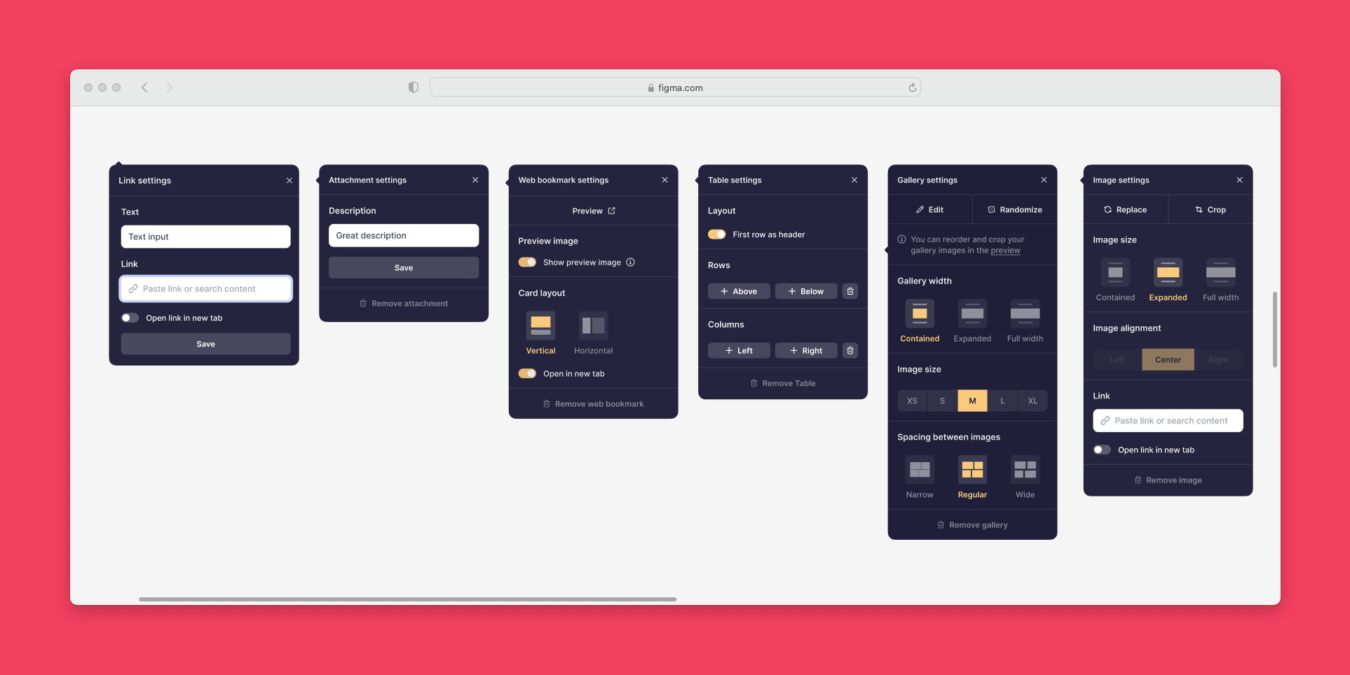
With that, we also touched the text menu and the campaign composer menu to all be dark and provide a consistent editing experience.
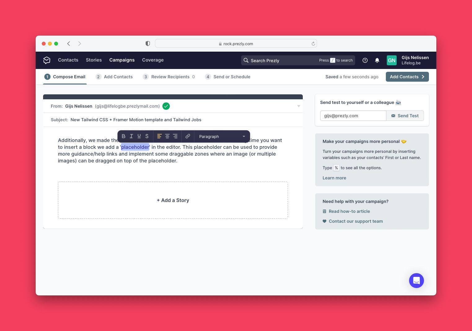
Additionally, we made the behaviour to add blocks more consistent where every time you want to insert a block we add a 'placeholder' in the editor. This placeholder can be used to provide more guidance/help links and implement some draggable zones where an image (or multiple images) can be dragged on top of the placeholder.
Pick a site before you start
Because Prezly supports multiple sites it's important to know in which space you are currently editing, because some settings and editing options are tied to the context.
- The available languages/translations are linked to the newsroom settings and defaults
- Newsroom contacts (think Author cards) are tied to the context of the newsroom
- Preview URLs are different
For any customer that had more than one space, we had some magic/hard-to-explain rules and combinations that guessed the site you wanted to create this story in. The problem was that sometimes we guessed wrong which made the editing experience much harder than it should be.
We'd see editors trying to change the language of their story, or insert a contact card that wasn't there. All because we picked the wrong site.
The decision to solve this was quite simple:
1) Pick your newsroom
The idea is to add a little friction to the flow to create a new story but avoid some headaches down the line.
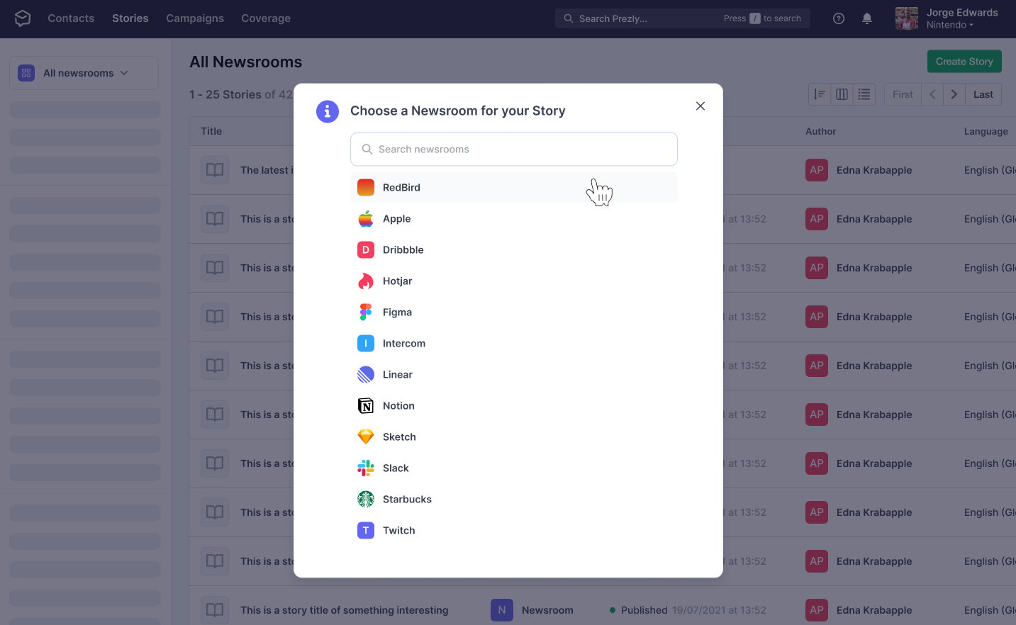
Obviously, customers with only one site don't see this picker.
2) Show which space you're in
Instead of having a super-weird UX pattern where one dropdown (site dropdown) would serve as both a breadcrumb and a 'change your newsroom' flow was utterly confusing.
So we moved the 'change newsroom' to an advanced settings pane and made the site indicator prominent and read-only so there is no more confusion as to which space you're editing in.

Image Uploader
Behind the scenes, we're using uploadcare.com for all uploads like attachments, videos, media galleries and pictures. This is a tremendous help as they provide uploading tools but make it easy to transform and serve those assets through their CDN.
We have a deep integration of Uploadcare within Prezly but the most noticable integration for our customers is the upload modal.
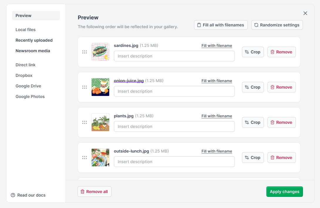
So we looked at a lot of sessions where people were using this modal and came up with a list of improvements:
- Improve copy of the different tabs + text
- Provide quick access to help docs
- Allow reordering image galleries during upload
- Implement a 'recently uploaded' tab to avoid having to upload the same asset
- Shortcuts to set the image description based on the file name
- Bring the UI closer to our design system
- Add a 'newsroom media' tab enabling editors to pick content from their site media kit
We're not done yet. But between now and my previous post on building an editor-friendly writing experience we've made good progress.
- ✅ Auto-save to avoid losing work
- Awesome linking experience
- Easily link to other content in the same CMS
- Allow different type of links
- Highlight (and upgrade) broken links
- ✅ Use good typography
- ✅ Great support for lists
- ✅ Show pasted images inline
- ✅ Essential features done right
- ✅ Wrap long lines
- ✅ Make it fast (speed/performance)
- ✅ Support text-correction extensions
- Undo/Redo (with shortcuts)
- Good pasting behaviour
We're currently working on a new interface for Story editing that goes beyond the Prezly editor (Snowbird). This will hopefully address most of the issues I listed in this previous post.
Are there any improvements you'd like to see?