Redesigning the writing & publishing experience
This project can be broken up in three different components:
- The writing experience / Editor itself
- CMS / The story editing interface
- The publication flow
The editing experience
Turns out that building a good editor in 2022 is not as easy as it sounds. While Google Docs, Dropbox Paper, Notion and Coda have their own proprietary solutions there is nothing out there that comes close to that level of quality.
In our research, when it comes to open-source projects, there is only really SlateJs (24k stars) and TipTap (14k stars) worth considering to build an experience on.
I've wrote about this in a previous blog post:
We've been investing in our version of slate editor and we've come a long way including keyboard shortcuts, a new + menu, embeds/website bookmark, auto-formatting/detection and improved text-alignment.
We still have long way to go but a solid plan how to get there. Short/mid term improvements include:
- better linking (link to internal references)
- improve the support for pasting from GDocs, PDF, ...
- placeholder components
- drag-dropping components
- more customisation on sizing/alignment of galleries
Most best practices can be borrowed from popular editors like Coda, Google Docs, Notion and even Microsoft Word. Oh, did you know the most requested editor feature is text-justification (for the web)! 🤯
CMS / The story editing interface
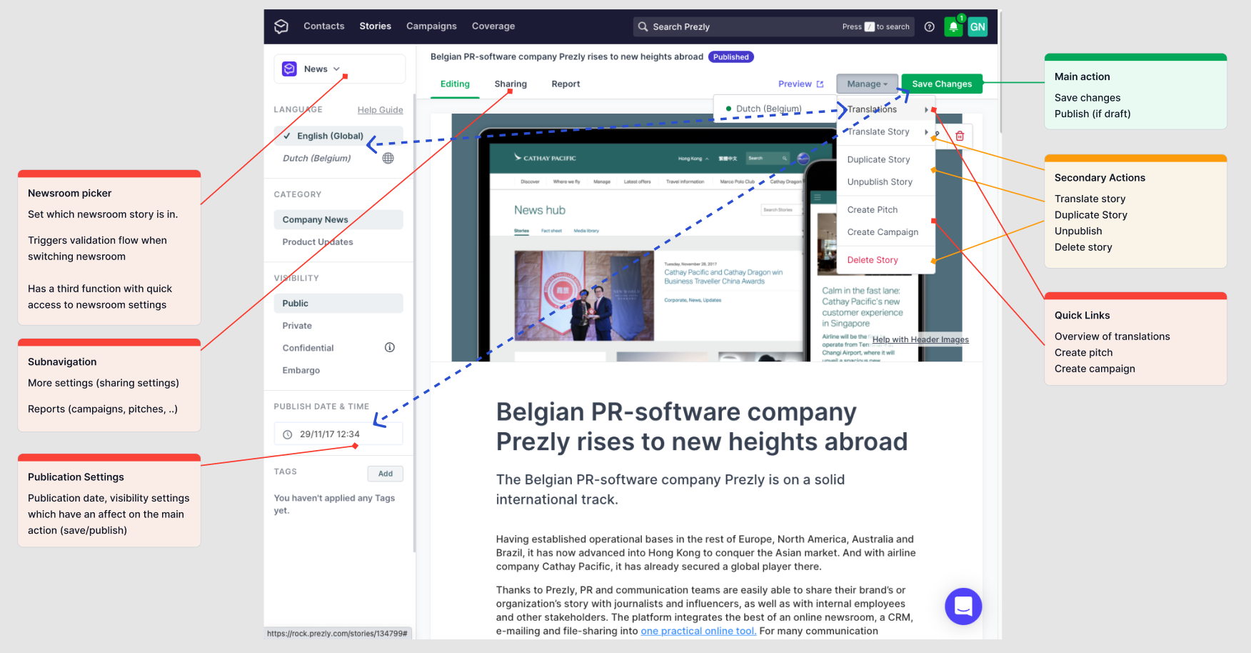
Turns out that this is a much harder problem to solve. Here is an overview of the story editing interface for a multilingual story with 2 translations in an account that has multiple newsrooms.

Although we do not have any major complaints (it's been in use for over 5 years) and is being used 1000x per day with over 300k stories published I feel there is a lot of room for improvement.
Some of the issues we might want to address:
- The left sidebar draws a lot of attention taking away attention from the content
- Language settings everywhere. The sidebar has a language switcher while translations and switching translations happens in the 'manage' dropdown
- Publication settings like visibility and publication date are in the left sidebar but the flow to finally publish a story is in the right top corner
- Newsroom picker is a setting but was lifted as some kind of super setting. On other pages it acts as a filter/navigation but on this page it's a setting
- General page canvas. The combination of the sidebar, sub-navigation and manage tab makes the interface overwhelming
The publication flow
In today's interface the publication flow is mixed in with the rest of the settings and the writing interface. And because some of the settings (scheduling, embargo, private story) affect the publishing behaviour this comes with some confusion.
To work around this we have introduced a 'great job publishing' success modal together with dynamic labels on the main publish button.

The more we work on the story edit and gather more information through desk research and customer interviews the more we are realizing that it might be better to break up the publication flow all together.
We're stuck
At this point I feel we're stuck. We've looked at all our competitors, the best CMS systems out there and have browsed the web for inspiration.
It feels like we've dug our hole too deep and are trying to solve too many things at the same time. Please send help!
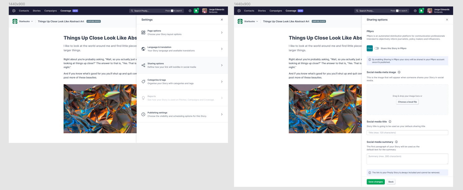
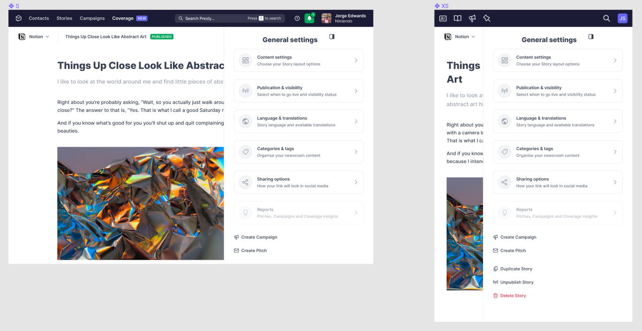
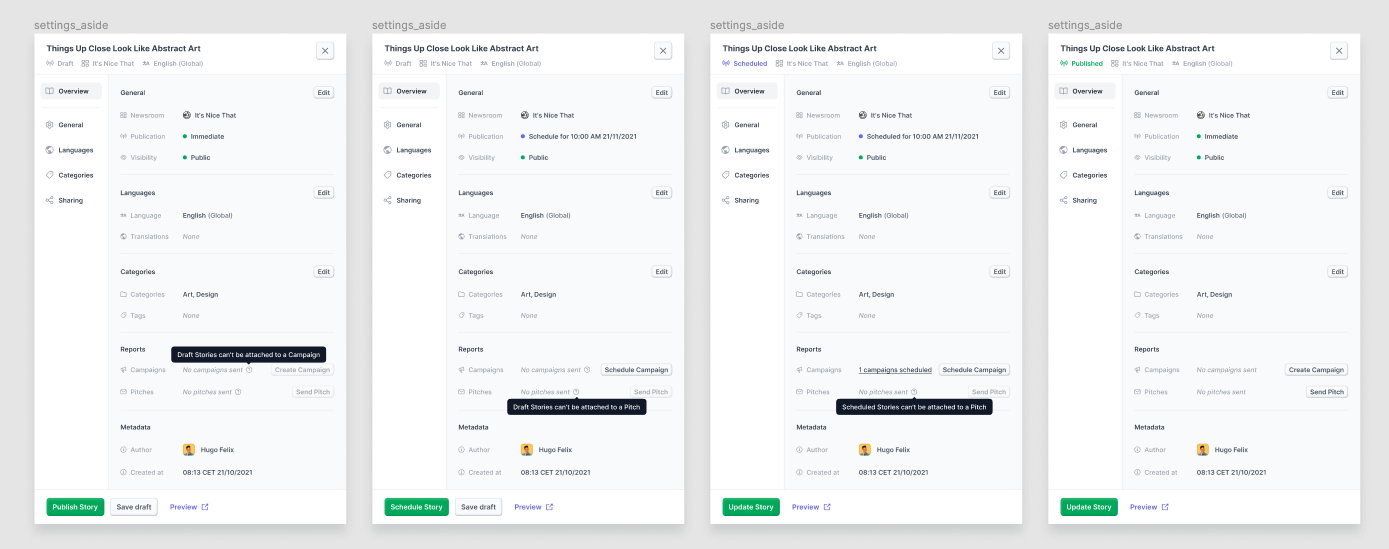
Here is a list of assets/attempts (please note that these are just random picks from a larger project including low fidelity wireframes or idea sketches)


